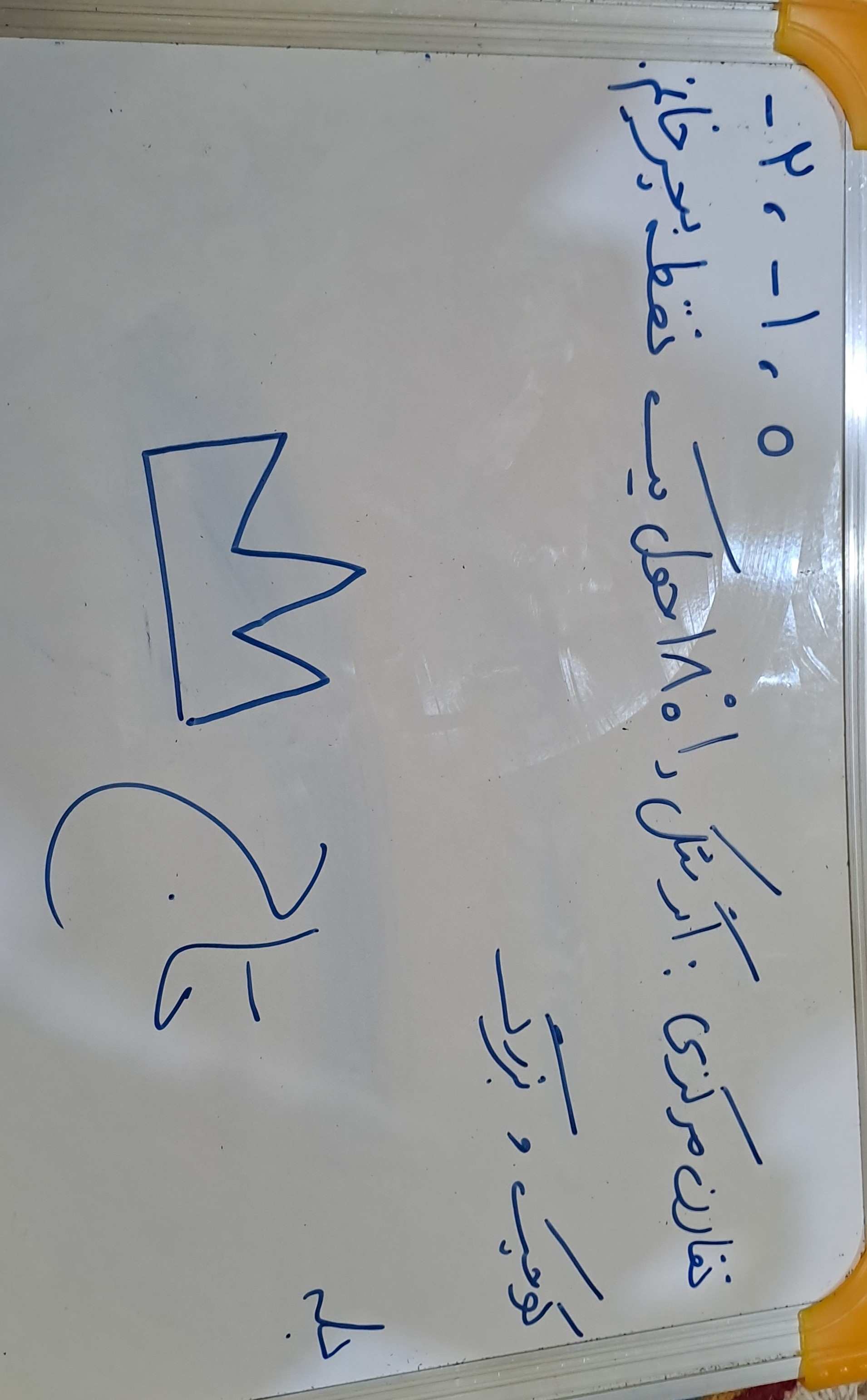
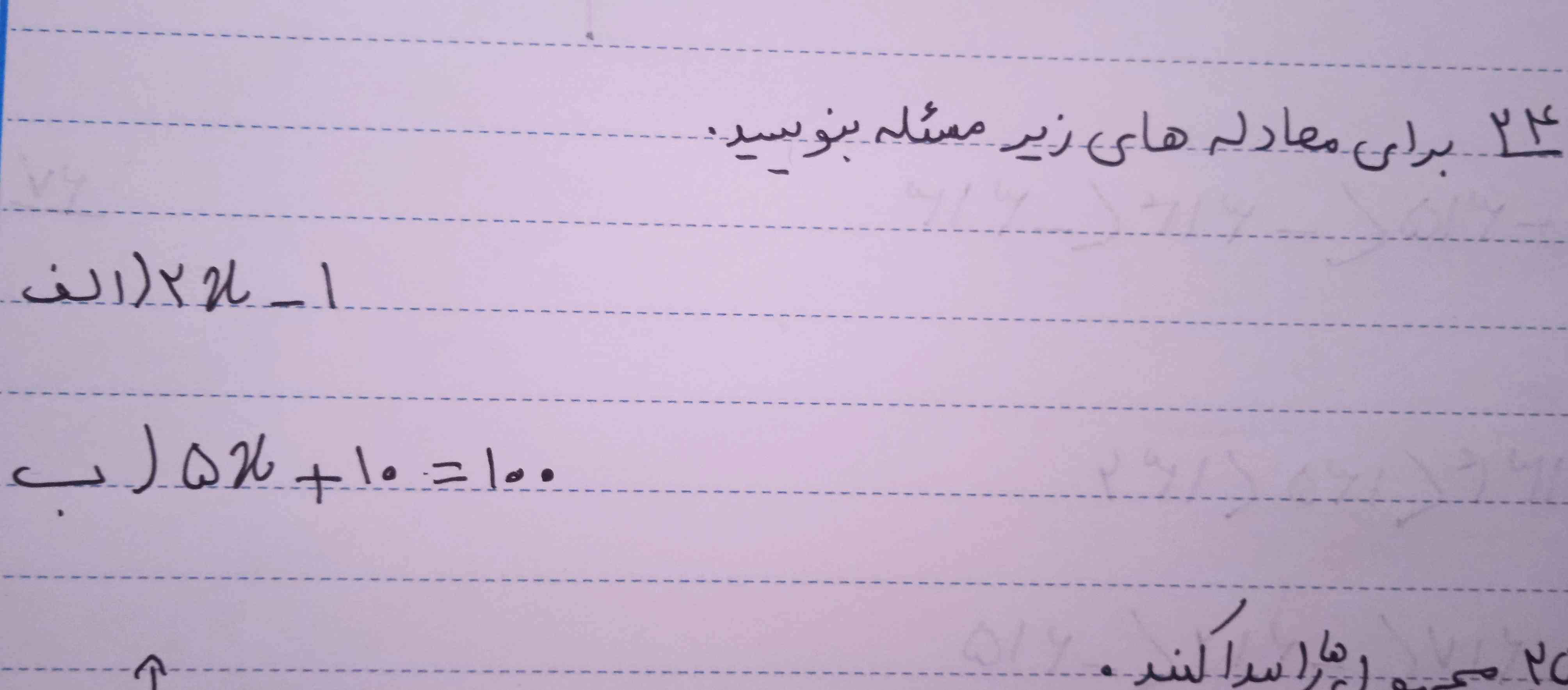
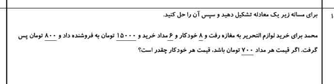
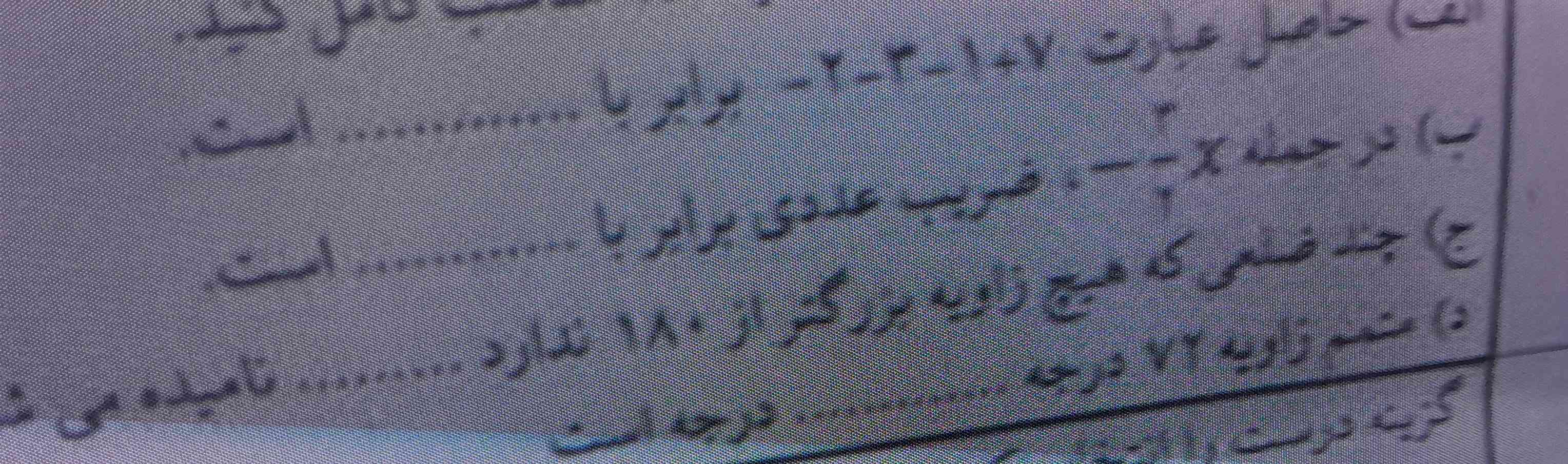
عدد قبل و بعد ۱-؟
تقارن مرکزی چیست؟
برای نشان دادن نیم خط از یک حرف............ و یک حرف ....... انگليسی استفاده میکنیم
قرینه هر عدد طبیعی از خود ان کوچکتر است ؟
تاج،فالو
اولی
قبلش -2
و بعدش 0
2اگر شکلی را دور نقطه ی مرکز تقارن بچرخانیم و شکل روی خودش قرار بگیرد، شکل تقارن مرکزی دارد.
3کوچک و بزرگ
4و درست است قرنیه هر عدد طبیعی کوچک تر خودش است
/* ---- Mobile-only compact layout (matches the reference card) ----
Desktop rules above are untouched. Everything below only fires
at phone widths and overrides just what's needed to shrink it. */
/* ---- Mobile-only compact layout (matches the reference card) ----
Desktop rules above are untouched. Everything below only fires
at phone widths and overrides just what's needed to shrink it. */
/* ---- Mobile-only compact layout (matches the reference card) ----
Desktop rules above are untouched. Everything below only fires
at phone widths and overrides just what's needed to shrink it. */
/* ---- Mobile-only compact layout (matches the reference card) ----
Desktop rules above are untouched. Everything below only fires
at phone widths and overrides just what's needed to shrink it. */
/* ---- Mobile-only compact layout (matches the reference card) ----
Desktop rules above are untouched. Everything below only fires
at phone widths and overrides just what's needed to shrink it. */
/* ---- Mobile-only compact layout (matches the reference card) ----
Desktop rules above are untouched. Everything below only fires
at phone widths and overrides just what's needed to shrink it. */
/* ---- Mobile-only compact layout (matches the reference card) ----
Desktop rules above are untouched. Everything below only fires
at phone widths and overrides just what's needed to shrink it. */
/* ---- Mobile-only compact layout (matches the reference card) ----
Desktop rules above are untouched. Everything below only fires
at phone widths and overrides just what's needed to shrink it. */
/* ---- Mobile-only compact layout (matches the reference card) ----
Desktop rules above are untouched. Everything below only fires
at phone widths and overrides just what's needed to shrink it. */
/* ---- Mobile-only compact layout (matches the reference card) ----
Desktop rules above are untouched. Everything below only fires
at phone widths and overrides just what's needed to shrink it. */