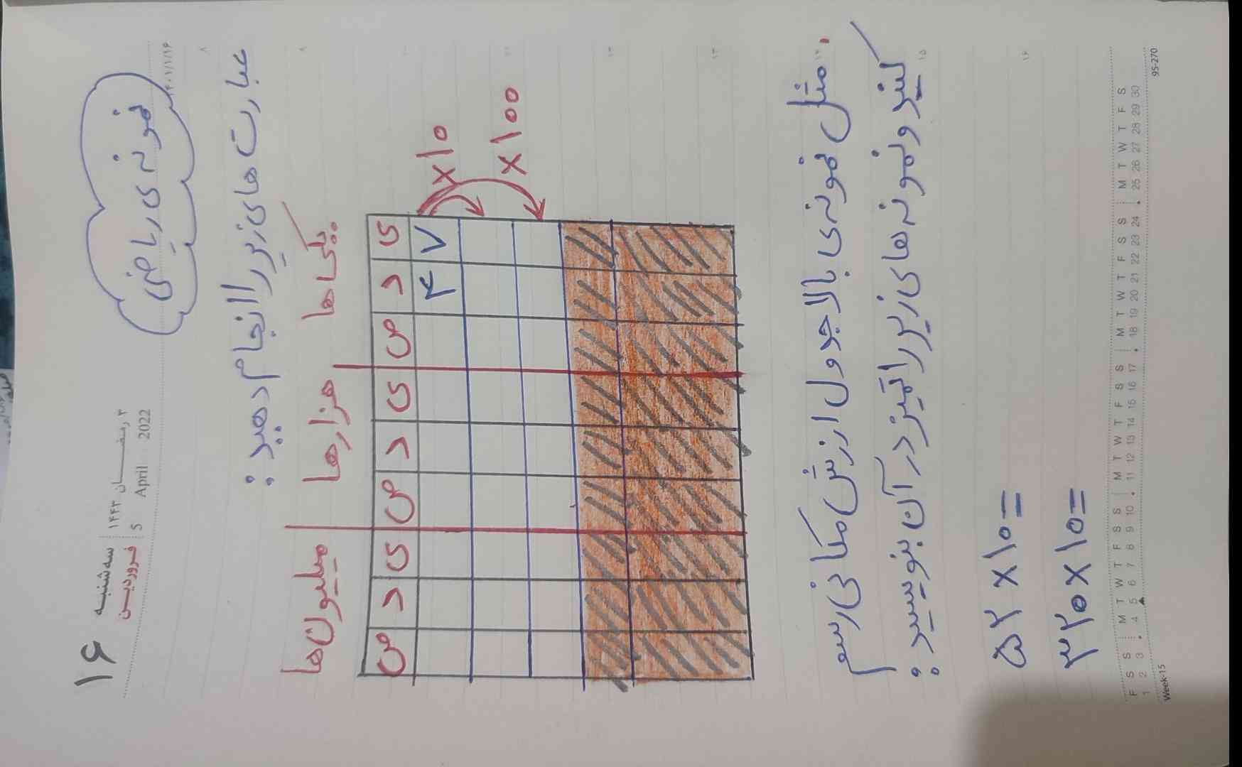
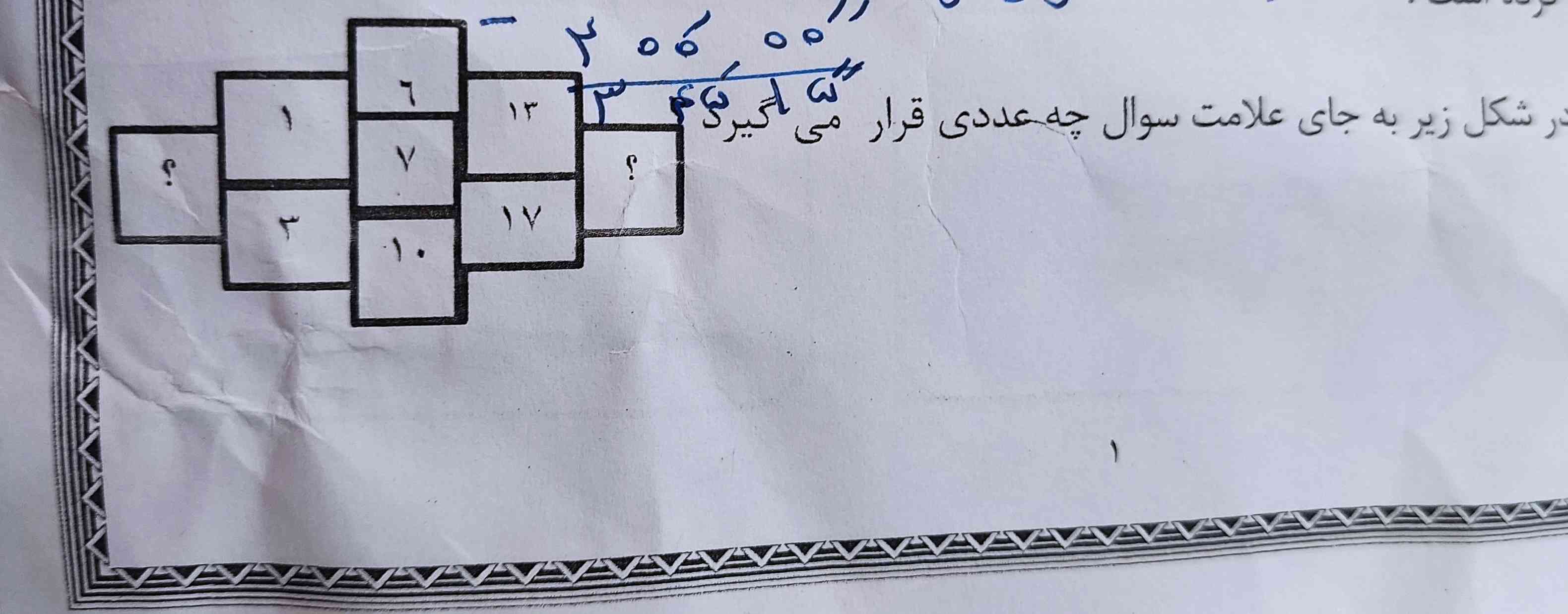
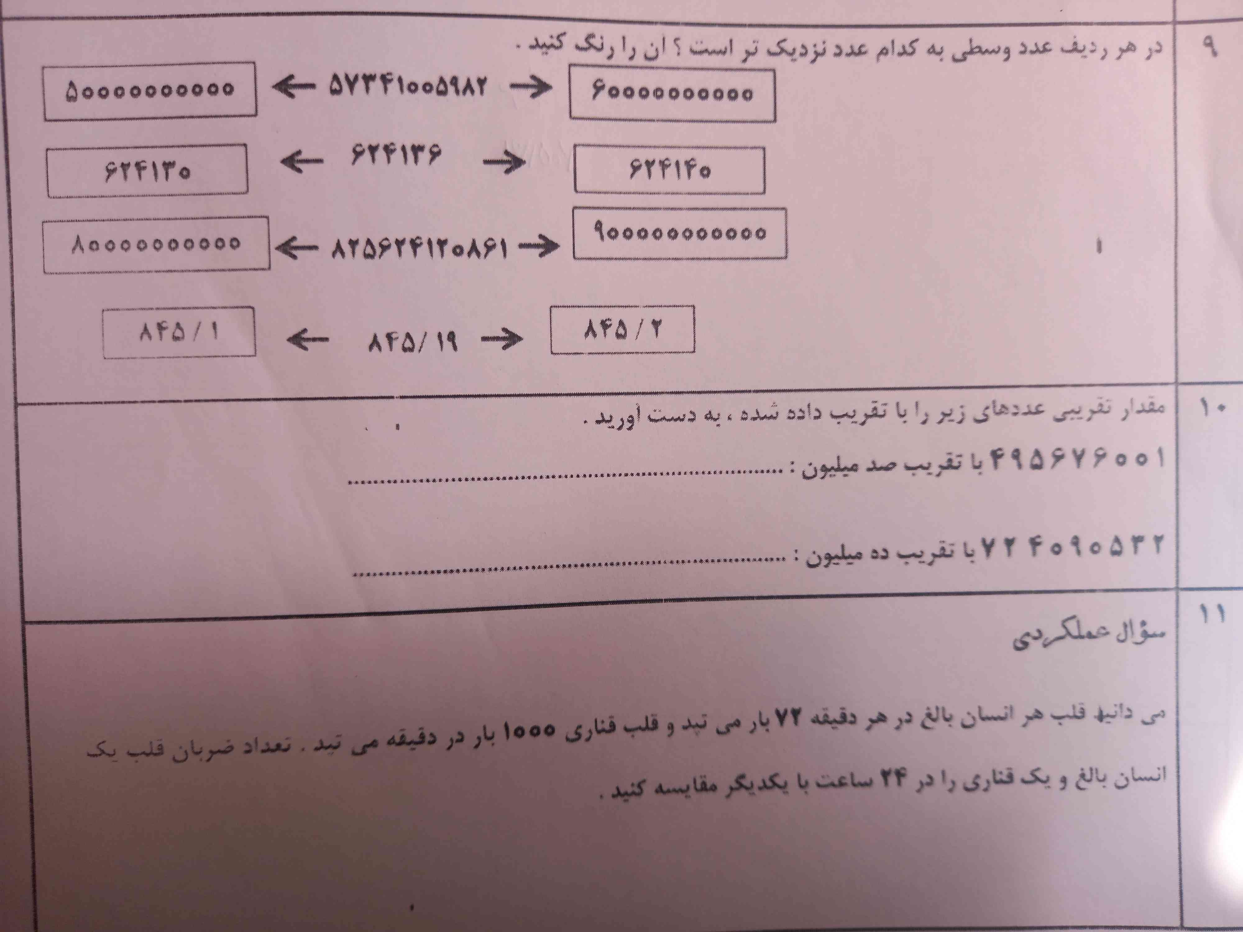
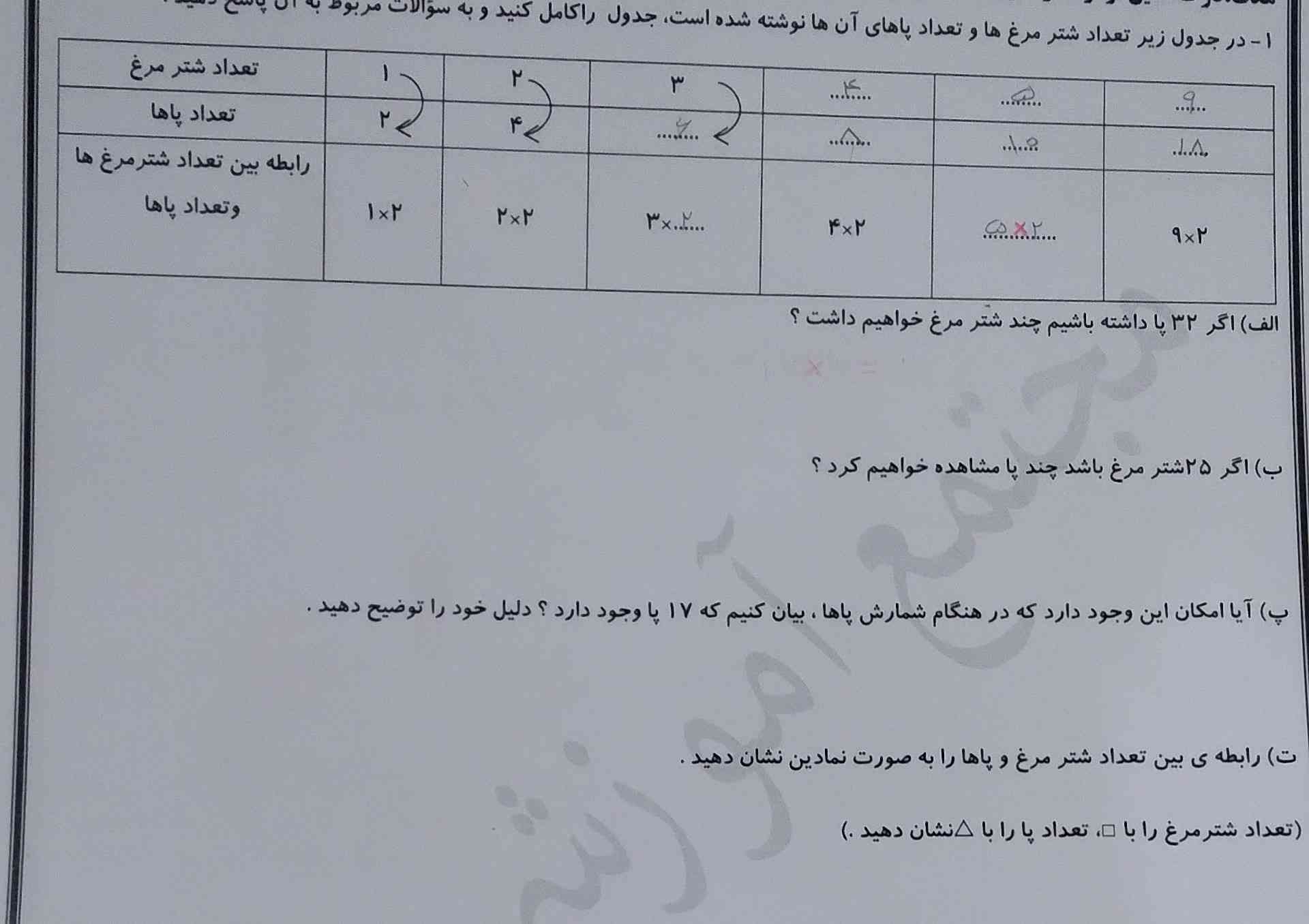
ببین ۵۱۷ دومی میشه چرا چون که ۴۷ و ضربدر ۱۰ کردیم شد ۵۱۷ و سومی هم میشه51700 و سوال ۲ که گفته ۵۲ ضربدر ۱۰ جوابش میشه ۱۰۴ عد ۱۰۴ وارد میکنی توی جدول ارزش مکانی و دوباره میای دومین ضربه رو که ۳۲۰ ضربدر ۱۰ هست جوابش میشه ۳۲۰۰ ۳۲۰۰ رو وارد جدول ارزش مکانی که مثل بالا بنویس

/* ---- Mobile-only compact layout (matches the reference card) ----
Desktop rules above are untouched. Everything below only fires
at phone widths and overrides just what's needed to shrink it. */
/* ---- Mobile-only compact layout (matches the reference card) ----
Desktop rules above are untouched. Everything below only fires
at phone widths and overrides just what's needed to shrink it. */
/* ---- Mobile-only compact layout (matches the reference card) ----
Desktop rules above are untouched. Everything below only fires
at phone widths and overrides just what's needed to shrink it. */
/* ---- Mobile-only compact layout (matches the reference card) ----
Desktop rules above are untouched. Everything below only fires
at phone widths and overrides just what's needed to shrink it. */
/* ---- Mobile-only compact layout (matches the reference card) ----
Desktop rules above are untouched. Everything below only fires
at phone widths and overrides just what's needed to shrink it. */
/* ---- Mobile-only compact layout (matches the reference card) ----
Desktop rules above are untouched. Everything below only fires
at phone widths and overrides just what's needed to shrink it. */
/* ---- Mobile-only compact layout (matches the reference card) ----
Desktop rules above are untouched. Everything below only fires
at phone widths and overrides just what's needed to shrink it. */
/* ---- Mobile-only compact layout (matches the reference card) ----
Desktop rules above are untouched. Everything below only fires
at phone widths and overrides just what's needed to shrink it. */
/* ---- Mobile-only compact layout (matches the reference card) ----
Desktop rules above are untouched. Everything below only fires
at phone widths and overrides just what's needed to shrink it. */
/* ---- Mobile-only compact layout (matches the reference card) ----
Desktop rules above are untouched. Everything below only fires
at phone widths and overrides just what's needed to shrink it. */