عزیزم سلام
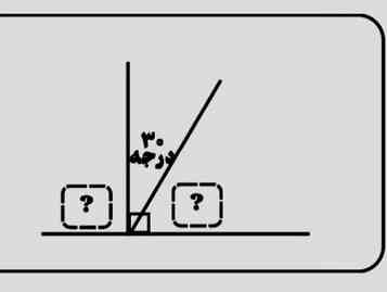
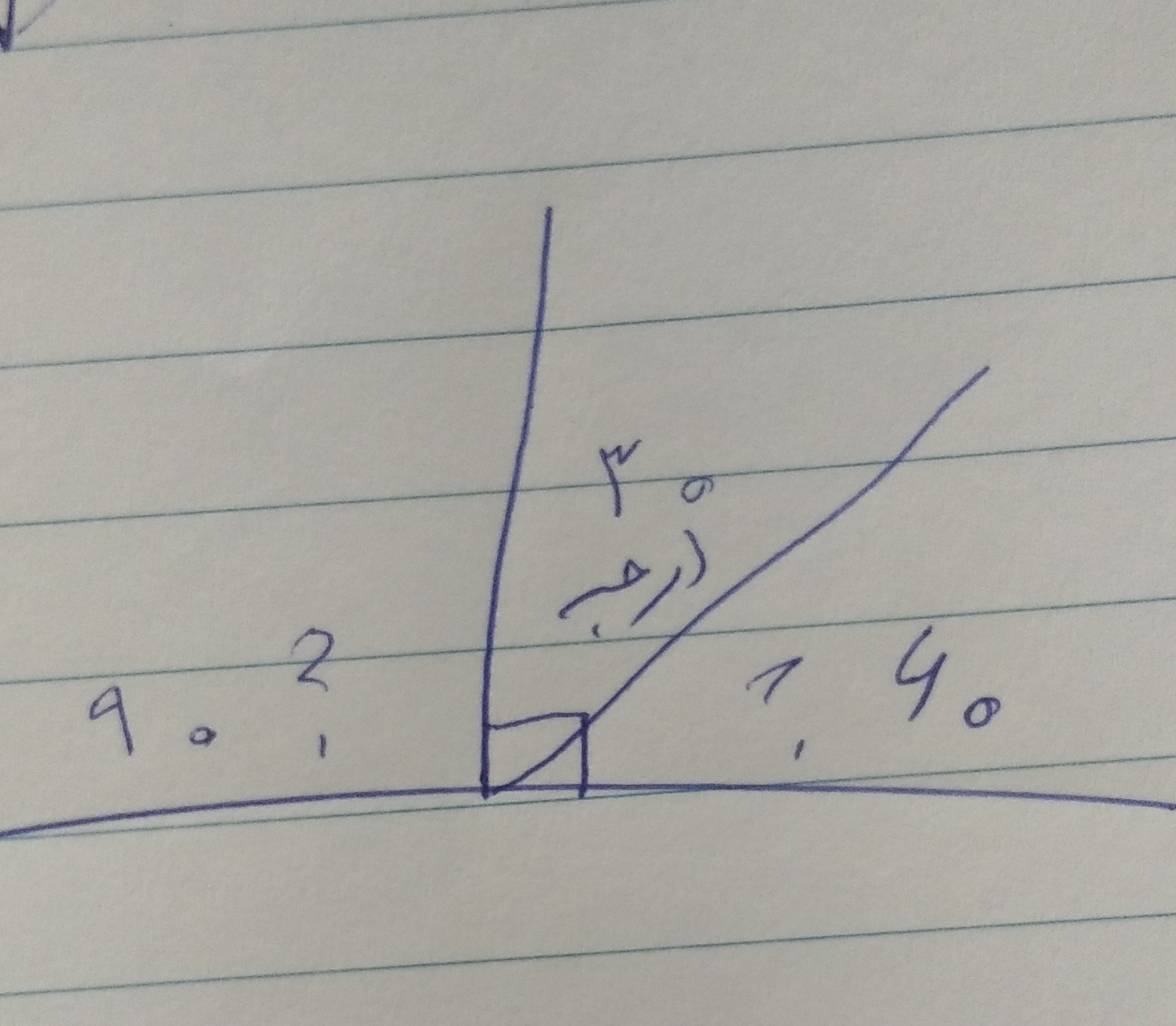
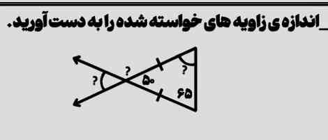
کل خط 180 سمت چپی 90 درجه تشکیل داده 30 درجه رو خودش بهمون داده پس 180 رو منهای 90 و حاصل رو منهای 30 میکنیم جواب 60 در میاد پس
سمت چپی 90 درجه
سمت راستی 60 درجه
معرکه یادت نره وگرنه گذارش میشی.
/* ---- Mobile-only compact layout (matches the reference card) ----
Desktop rules above are untouched. Everything below only fires
at phone widths and overrides just what's needed to shrink it. */
/* ---- Mobile-only compact layout (matches the reference card) ----
Desktop rules above are untouched. Everything below only fires
at phone widths and overrides just what's needed to shrink it. */
/* ---- Mobile-only compact layout (matches the reference card) ----
Desktop rules above are untouched. Everything below only fires
at phone widths and overrides just what's needed to shrink it. */
/* ---- Mobile-only compact layout (matches the reference card) ----
Desktop rules above are untouched. Everything below only fires
at phone widths and overrides just what's needed to shrink it. */
/* ---- Mobile-only compact layout (matches the reference card) ----
Desktop rules above are untouched. Everything below only fires
at phone widths and overrides just what's needed to shrink it. */
/* ---- Mobile-only compact layout (matches the reference card) ----
Desktop rules above are untouched. Everything below only fires
at phone widths and overrides just what's needed to shrink it. */
/* ---- Mobile-only compact layout (matches the reference card) ----
Desktop rules above are untouched. Everything below only fires
at phone widths and overrides just what's needed to shrink it. */
/* ---- Mobile-only compact layout (matches the reference card) ----
Desktop rules above are untouched. Everything below only fires
at phone widths and overrides just what's needed to shrink it. */
/* ---- Mobile-only compact layout (matches the reference card) ----
Desktop rules above are untouched. Everything below only fires
at phone widths and overrides just what's needed to shrink it. */
/* ---- Mobile-only compact layout (matches the reference card) ----
Desktop rules above are untouched. Everything below only fires
at phone widths and overrides just what's needed to shrink it. */