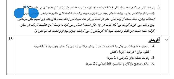
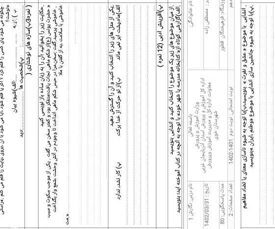
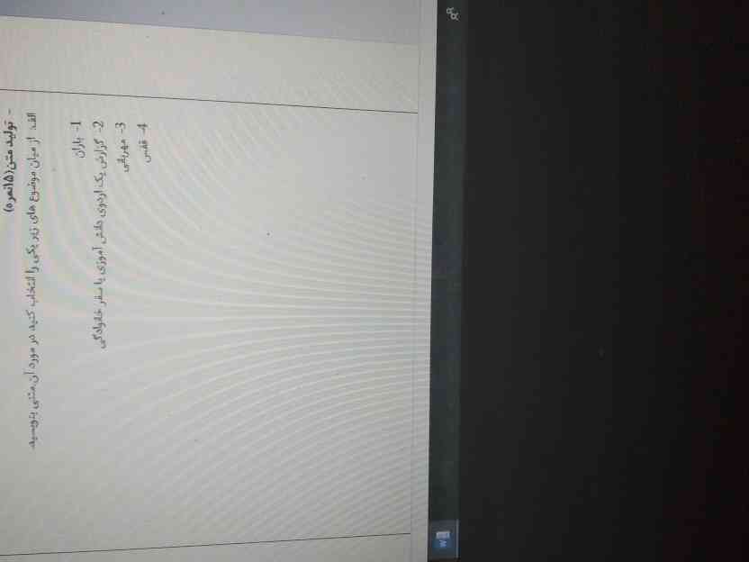
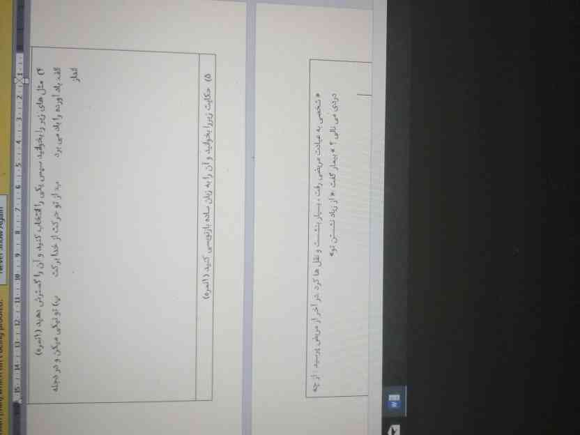
د. نگارش فقط ضرب المثل و بازنویسی حکایت میارن ک باید جواب بدی. چیزی خاصی نداره میتونی فقط همینا رو بخونی.
و بعدش چند تا موضوع ک باید انشا بنویسی.
موفق باشی. 🍃✨
معرکه یادت نره.
من خودمم ننوشتم ولی ببین خیلی زیادن کسی فک نکنم بتونه اینجا بفرسته سرچ کنی تو گوگل گام به گام نگارش سوالاشو برات میاره با جواب بعد از اونجا بنویس راحت ترم هست
/* ---- Mobile-only compact layout (matches the reference card) ----
Desktop rules above are untouched. Everything below only fires
at phone widths and overrides just what's needed to shrink it. */
/* ---- Mobile-only compact layout (matches the reference card) ----
Desktop rules above are untouched. Everything below only fires
at phone widths and overrides just what's needed to shrink it. */
/* ---- Mobile-only compact layout (matches the reference card) ----
Desktop rules above are untouched. Everything below only fires
at phone widths and overrides just what's needed to shrink it. */
/* ---- Mobile-only compact layout (matches the reference card) ----
Desktop rules above are untouched. Everything below only fires
at phone widths and overrides just what's needed to shrink it. */
/* ---- Mobile-only compact layout (matches the reference card) ----
Desktop rules above are untouched. Everything below only fires
at phone widths and overrides just what's needed to shrink it. */
/* ---- Mobile-only compact layout (matches the reference card) ----
Desktop rules above are untouched. Everything below only fires
at phone widths and overrides just what's needed to shrink it. */
/* ---- Mobile-only compact layout (matches the reference card) ----
Desktop rules above are untouched. Everything below only fires
at phone widths and overrides just what's needed to shrink it. */
/* ---- Mobile-only compact layout (matches the reference card) ----
Desktop rules above are untouched. Everything below only fires
at phone widths and overrides just what's needed to shrink it. */
/* ---- Mobile-only compact layout (matches the reference card) ----
Desktop rules above are untouched. Everything below only fires
at phone widths and overrides just what's needed to shrink it. */
/* ---- Mobile-only compact layout (matches the reference card) ----
Desktop rules above are untouched. Everything below only fires
at phone widths and overrides just what's needed to shrink it. */